HIERARCHY
Visual hierarchy establishes the order of importance through systematic variation. Size, weight, and position guide the eye and communicate structure. When hierarchy breaks down, information becomes equal and meaning is lost.

Adjust the slider to see how size affects hierarchy. Values below 18px break the relationship.
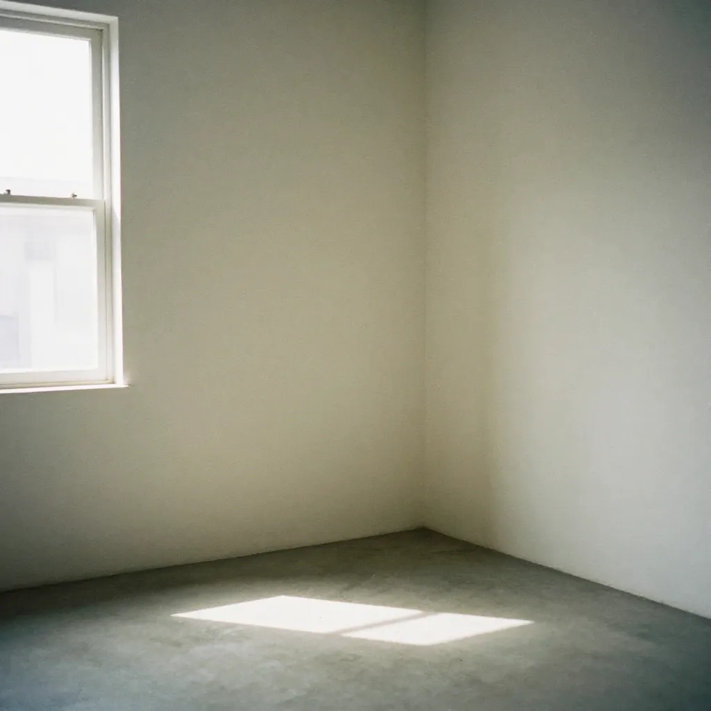
NEGATIVE SPACE
Space defines form. The relationship between occupied and unoccupied areas creates rhythm and focus. Generous spacing elevates content and signals confidence. Tight spacing creates tension and density.

Modify spacing to observe how negative space affects visual balance and readability.
UNITY
Unity emerges from consistent application of rules. When elements share visual characteristics—color, form, spacing—they form a cohesive system. Unity creates recognition and reinforces identity.

Change weight to see how consistency maintains unity across elements.
CONTRAST
Contrast creates separation and emphasis. Maximum contrast—black on white—ensures clarity. Contrast in scale, weight, and color establishes hierarchy. Without sufficient contrast, elements merge and meaning is lost.

Reducing opacity demonstrates how contrast affects readability and emphasis.
ALIGNMENT
Precise alignment creates order and connection. Elements aligned to a common axis form relationships. The grid system provides invisible structure that guides alignment decisions. Misalignment creates visual noise.

Introduce offset to see how alignment breakdown affects visual order.
BALANCE
Balance distributes visual weight across the composition. Symmetrical balance creates stability. Asymmetrical balance creates dynamism. Visual weight comes from size, color, and position. Balance ensures the design feels complete.
Adjust size to observe how visual weight affects balance and composition.